

1. “The First Step” 1 SNEAKER
- Hero video: A large, high-resolution, full-width video plays on a loop in the background. It features a diverse set of individuals in motion—running in the city, walking through a park, dancing, or simply taking a first step. The focus is on the human element, showcasing real-life experiences enabled by the shoes.
- Start with the right step.“
- Experience life in motion. Experience Wear Kick.“
- Call-to-action (CTA): A prominent, subtly animated button with a clear contrast to the background.
- Shop the New Collection“adidas.co.in
2. “Featured Styles”
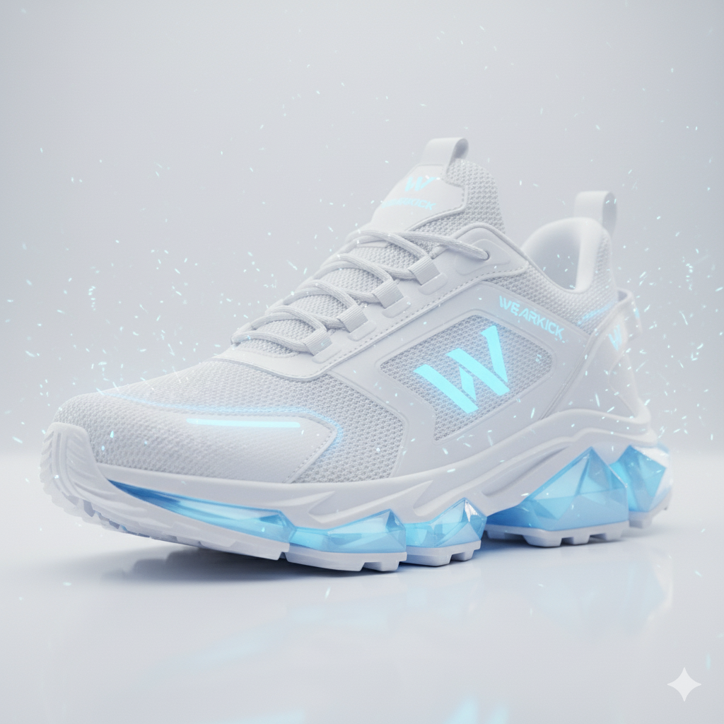
- Layout: A dynamic, visually striking three-column grid. Each column highlights a different style or collection (e.g., performance runners, urban sneakers, and lifestyle kicks).
- Product imagery: Each column features a high-quality, professional image of a featured shoe, with a subtle hover effect that changes the photo to a different angle or shows someone wearing the shoe.
- Labels and links: A clear heading for each style (e.g., “The Runner,” “The Urbanite,” “The Wanderer“) is paired with a concise description and a “Shop Now” link.
3″Kicks on the Streets”
- Layout: An interactive carousel or tiled gallery featuring real-world, user-generated content (UGC) from social media.
- Purpose: Builds brand trust and community by showing actual customers wearing and enjoying the shoes in their daily lives.
- Visuals: Each tile displays a high-resolution photo from a customer, with their social media handle subtly displayed.
- Hashtag integration: Prominently display the brand’s hashtag, for example, “#WearKick,” encouraging visitors to share their own photos.
4.”The Craft”
- Visual story: A dedicated section with an elegant, minimalist design that tells a story about the brand’s unique selling proposition. This could focus on sustainability, innovative materials, or craftsmanship.
- Interactive element: A short, professional video or animated infographic illustrates the materials or process in a compelling way. For example, showing a shoe deconstructed to highlight its sustainable components.
- Text: The accompanying text explains the brand’s commitment to quality, comfort, and a better world.
- CTA: A link to the “Our Story” or “Sustainability” page for those who want to learn more.
5. “Find Your Kick”
- Layout: A simple, scannable grid with clean icons and links to the main product categories:
- Men’s/Women’s soon to be launched
- Sale/New Arrivals soon will on top
- Usability: This feature ensures visitors can quickly navigate to the section most relevant to their needs, improving the user experience.
6. “Join Our Community”
- Value proposition: “Join the Kick Club. Get insider access and exclusive offers.“
- Simplicity: The input field is clean, requiring only an email address.
- Incentive: “Get 15% off your first order.”
7. Your Next Step”
- Links: A comprehensive set of links, categorized clearly, including:
- About Us: Our Story, Careers.
- Support: FAQ, Shipping & Returns, Contact Us.
- Community: Instagram, TikTok, Facebook links.
- Policy links: Clear links to Privacy Policy and Terms of Service to build trust.
- Design: A contrasting background color to visually separate it from the main content.
- https://wearkick.com/